Thursday, June 2, 2016
Parachute
To make this instillation piece, we blew up a balloon and put two layers of plaster strips on it so that we could have a thick parachute. After the plaster was dry, I popped the balloon and painted it. I was originally going for a sunset look, but I still like the way it turned out. I liked how we all came up with ideas and decided as a class which would be the most fun. I wish we could have had more people involved so that there would be more balloons floating around school.

Scraffito Tray
Scraffito is when you scratch through the surface to expose another layer. We did this with a black underglaze that we painted onto a slab of clay fitted to a styrofoam plate. After the underglaze dried, we were able to scrape it off. I like the way mine turned out, I would probably do more planning next time. After making the design we wanted, we dipped it into clearglaze and it went into the kiln!


Empty Bowl Project
Two out of my three bowls were thrown on the wheel. I like using the wheel, although it can be difficult and frustrating. One of them turned out just fine while the other ended up having a very weak spot that turned into a hole. Instead of starting over, I made more small holes and added cracks to them to make it look intentional. That was my favorite out of the three because it looks old and damaged. The third bowl was made out of wire. I took a styrofoam bowl and molded the wire around it. I really liked how that one turned out, too.


Unconventional Materials
I used sand as my unconventional material. I mixed it with elmer's glue and poured it onto a plastic bowl that I covered in aluminum foil. When the glue dried, I took it off of the bowls shape and removed as much of the aluminum as I could. It turned out to be really cool and a very creative idea. I probably will do this again as an activity at a party or get together because its very fun and cool and you could even add food coloring and make a very unique creation. I would find another way to make sure the glue doesnt stick to the bowl because the aluminum foil was hard to peel off.
Wednesday, March 23, 2016
Pit Fire: Part 2


Pit Fire: Part 1
Pit firing is the oldest method for firing pottery. It uses objects to burn in order to make smoke that stains the piece. A foil saggar is a process in which the piece is wrapped in aluminum foil so that the objects that are placed inside the foil can burn and stain the piece in different ways and colors.


Relief Post: Part 2
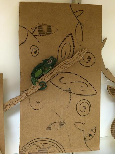


I think my piece was very successful. I sort of wish I would have done my original plan of an underwater type of thing where the fingers were coming out without the palm being visible. But I think my execution of what I ended up doing was great. The mini tile helped me understand how relief worked and was good practice of scraping away clay to reveal something. The cardboard was fun but I don't think my group's project necessarily helped with the main relief piece. I overcame shaping the fingers which was a problem I had. Getting the fingers to form out of the background was difficult, but it ended up working out.
Monday, March 7, 2016


Tuesday, February 2, 2016
Relief Post: Part 1
https://www.pinterest.com/habana1023/relief-inspiration/ link to pinterest board
My pinterest board has a couple different themes that I am trying to explore. One is the hand relief that would be pretty three dimensional. I remember when I was a kid, we had this toy that was tiny metal pins you could push to make the image on the other side (I'll attach a picture so you know what I'm talking about). I like how in some of the pins I found, it showed the hand coming up through water.. I tried to quickly sketch something like that in my sketchbook. Another theme I was interested in was a colorful abstract piece using nails and either rubber bands or yarn (I pinned a really simple example of the principle of what I mean). I would use those abstract pieces that I pinned as inspiration to make a colorful landscape (almost) with a lot of dimension and a smooth texture. I also thought that the 2D/3D approach might be cool, as the pin the zebra and ship suggest, so that it would be a 3 dimensional sculpture, but it would also have some perspective so that it looked even more 3D from a specific angle.


My pinterest board has a couple different themes that I am trying to explore. One is the hand relief that would be pretty three dimensional. I remember when I was a kid, we had this toy that was tiny metal pins you could push to make the image on the other side (I'll attach a picture so you know what I'm talking about). I like how in some of the pins I found, it showed the hand coming up through water.. I tried to quickly sketch something like that in my sketchbook. Another theme I was interested in was a colorful abstract piece using nails and either rubber bands or yarn (I pinned a really simple example of the principle of what I mean). I would use those abstract pieces that I pinned as inspiration to make a colorful landscape (almost) with a lot of dimension and a smooth texture. I also thought that the 2D/3D approach might be cool, as the pin the zebra and ship suggest, so that it would be a 3 dimensional sculpture, but it would also have some perspective so that it looked even more 3D from a specific angle.


Sunday, January 31, 2016
Inspired Artist
The artist that I found is named Daniel Arsham. Daniel was born in Miami and currently lives in New York. He is a contemporary artist who focuses on the human figure, technological objects, and architecture. Uniquely, he executes 2D (drawings), 3D (sculptures), and 4D (preforming) arts. In most of his material, he depicts erosion, which is interesting when discussing the human figure. Architecture is a prevalent subject throughout his work as well. He is recognized for his creation in the stage design for the Mercy Cunningham Dance Company, which toured in Australia, France, and multiple locations in the United States. I haven't seen a lot of his performance art, but I do find a lot of inspiration in his sculpting. Personally, I love using the human figure as a subject in my art, so seeing such an interesting take on it (the erosion he creates) inspired me to do something different with my own human figures, His website is http://www.danielarsham.com/


Wednesday, January 6, 2016
Final Blog Post
Kehinde Wiley's art is interesting to me because he has very realistic people in the foreground and then he usually does a flowery or decorative background. I like his art a lot and my alien piece reminds me of his art because I tried to do a realistic looking female alien with the flowers in the background.


After making this piece, there are things I would have liked to do better. Wiley's art looks a lot more realistic than my alien, so based on his art, I would have liked to make this look better.
My essential question piece also reminds me of Wiley's art because it is focused on one person with an interesting background.

This is a completely different style from Wiley, but it is similar because it's one singular person in the middle of the canvas with a background. The difference is the detail, realism, and the complexity of the background. My background is more basic, but it is as important as his. The highlight around the body speaks in almost the same way as the flowers overlapping his subjects limbs.
Never Got to Say - Prints

Art Museum

This piece was one that caught my eye because of the different textures and interesting colors. I think it's cool that the artist used orange to contrast with the black and white used to make the piece. It also looks like a natural symbol in music, so that caught my eye because music is a big part of my life.

This piece is one that I didn't appreciate until I took a moment to look further into it. I think all of the detail is amazing, and the water and sky are very realistic. I admire how the artist gave every piece of clothing in the piece some detail and folds.

This piece did absolutely nothing for me. I think it was probably done by a four year old...
Non-Traditional Art Materials
I didn't do this project. It was really hard for me to come up with something to use that would still feel like art to me. I guess you could say I'm more of a traditional artist who uses the normal mediums like paint, colored pencils, and charcoal.
Tuesday, November 3, 2015
More Than Words

The postmodern principle that I chose was text in art. The text I used to make this piece was lyrics from love songs and also messages between my boyfriend, Cole, and I. My two best friends just moved away, and he has been so helpful to me and my grieving in this time of loneliness that I'm experiencing. It feels like Cole came into my life at the exact right time. Without him to lean on recently, I don't know how I would stay sane, so this piece was inspired by/dedicated to him. Affection is my "love language," and just the touch of a hand can make me feel 100 times better. My boyfriend has offered me so much emotional support and always been there when I needed a hug. I think that the image I depicted shows a lot of emotion and creating it and seeing it now gives me the same kind of feeling I get from being with Cole. I think it turned out really well; I'm really proud of it.
Thursday, October 15, 2015
Post-Modern Principles
I think that having a background knowledge of the principles of art is important to achieve and execute what the artist is trying to create. If an artist didn't know the concept of lights and darks or how to use a palate knife, it would be hard to create an art piece efficiently. I agree that there could be easier ways to communicate these principles into artwork, but I also think that putting meaning into art comes with time. In my opinion and from my experience, an artist should understand the skill set and know the material and medium they're working with so that all they have to focus on is what they are expressing through their art. It would be like asking me to write my life story in Spanish. I know how to say hello and goodbye and a few phrases in between, but I wouldn't be able to get my messages across without a prior knowledge of the language. Once I have that understanding, I could express myself through it.
Monday, October 5, 2015
Essential Question
I started this project after both of my closest friends moved out of state. Being a senior, this upset me a lot; I wanted to have the experience of senior year with my two best friends. To pick a word, I wrote down trust. That made me think of abandonment and I got pretty upset thinking about all of these emotions inside. I felt very alone for a while, but I made some new relationships that helped me get through this hard time. For my project, I'm using a pallet knife and acrylic paint to depict a person sitting alone. I want to make a series so that I can show another person sitting down to join and comfort the first person painted.


Thursday, September 24, 2015
Is Art Without Meaning Decoration?
Does every piece of art have to have a deep, personal meaning? I think that every piece of art that is created is very personal to the artist. For example, places like Wine and Design give the artist a rubric and examples, but every painting turns out different. Every artist has different shades and strokes of their brush creating original paintings. I think that these subconscious actions provide meaning. This meaning may not convey the artist deep emotions and troubles or the pure joy they are feeling, but the fact that every single piece of art is specifically different and unique from any other piece of art created gives it meaning. I also think that meaning can come from the pride one would feel in the art they made. Like the mural in the article, the person who painted that was probably really proud of it. Even though it is a decoration, it has meaning because someone put their time, effort, and a little piece of their heart. So I think that art is art. Decoration is also art because there is always the personal touch that every different person has to add. The picture attached is a piece I painted. I didn't have any specific reason to paint this, other than I like sunsets. But I'm very proud of it and it makes me happy that I could make something this beautiful. It is hanging in my living room as decoration, but every time I see it, I feel proud, so I think every piece of art has some meaning.


Tuesday, September 15, 2015
Elements of Art

Thursday, June 5, 2014
Full Figure


Subscribe to:
Posts (Atom)